
So, this design was partially my own fault. Kinda. Only sort of. Two of my friends from Third Impact Anime, Tobias and Bill, entered into a blood pact with one another. Tobias had really gotten into the critically acclaimed MMO Final Fantasy XIV (which is my fault), and Bill was already neck deep into One Piece. And both wanted the other to try their thing. And that’s what they did. They divvied up how much One Piece would equate to how much Final Fantasy XIV, and so their dark bargain was made. And to keep them honest and to chronicle their journeys in Eorzea and on the Grand Line, I told them that they should podcast about it.
And lo, didst they agreeith! But that meant they needed a logo. And cover art. And promotional images. So to work I went. After all, this was (partially) my fault.

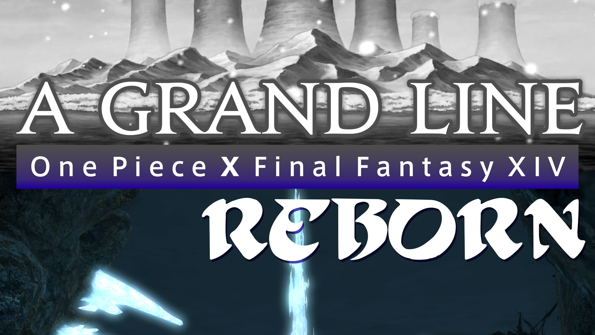
Since this was to be a logo that had to both be about Final Fantasy XIV (FFXIV) and One Piece, I started off by figuring out the color scheme. At the start, it begins with gray because One Piece began as a manga after all. It then transitions into a blue used in FFXIV. The “A Grand Line” part is in the Jupiter font, which is the base font used for FFXIV’s own logo work.

The cover art for any particular episode follows the same concept. A grayscale One Piece image for the top half, and a FFXIV color image for the bottom. Logo right there in the middle. And of course, the “a Third Impact Anime podcast” tag in the lower right-hand corner. Since it’s a part of that podcast family after all. Social media posts follow similar design logic, just as rectangle versus a square.
And that’s the story of A Grand Line Reborn! If you are interested in either One Piece or Final Fantasy XIV, you should check it out! Give it a listen! It’s a good time.
Share this content: